So, this is mostly for my own future benefit because I keep forgetting my own methods. But I'll try to explain things enough that it might be useful to other people too. You should be moderately competent with whatever art program you're using, and have some idea about colours and shading.
My basic philosophy is: realism is boring, and mistakes add texture.
This painting technique works just as well for photos as for the sort of 3D renders I usually do, you can skip the 3D model section if that's not relevant to you.
Sections:
The main reason I do paintovers is that I'm never satisfied by the results when I try to softly shade three dimensional shapes by eye, especially faces or anything with dramatic lighting.
What I can draw to my own satisfaction is anime style flat shading. So my approach to paintovers is to think of them as flat shaded images with simple highlights and shadows, and even lines. I use the original image to get the colours and gradients right, which combined with rough grainy strokes creates an illusion of the sort of soft, three dimensional shapes I have trouble with. I use rough brushstrokes and a limited palette since (a) it's less work and (b) it creates ambiguity, and the viewer's imagination fills in the details better than I can paint them.
If your artistic instincts are different to mine, this approach may not be very helpful.
To give an example, here is my drawn version of Useful and Pretty, and here's my (not entirely successful) attempt to create the equivalent scene as a paintover of a 3D render.

Here's a prettier paintover I've done:
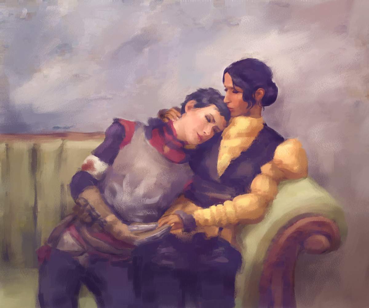
I use Blender, which is difficult but free. I'm no good at making people but I can create simple 3D objects like glasses/candles etc.
This is a screenshot of the Blender scene used to create Nothing's Wrong. There's models of Isabela and Hawke as well as fabric, a candle, a table, a map, beer glasses, beer foam, and eight light sources of different colours and shapes. I also used two large planes to block the light from parts of the scene but if I'd included those you wouldn't be able to see anything else. The aqua background is a large plane with an edited screenshot of the Hanged Man on it.

For fanart of video games, I download models of the characters as extracted by other people. There's a program called XPS/XNALara specifically designed for posing and rendering such models, and most models I've found have been in XPS format. I've never tried XNALara, since I don't want to learn a new program, and XPS models can be imported to Blender using these Blender to XPS tools. You can find a lot of XPS models on deviantArt, and Padme4000 has a lot for Bioware games in particular.
Posing the models is fiddly and takes practice. There's tutorials on it around the place. Looking at images of of real people (including myself in the mirror) can help make the body language more believable.
The way I compose these scenes is generally one or two figures and key objects in the foreground, and then a blurry quasi-abstract background which varies in brightness and colour to help highlight whatever I want to emphasise in the foreground.
This background is created via a single flat image, an Emission (glowing) material on a plane angled to face the camera and sized to fill the view.
I create the background image in a separate art program, starting with a canon screenshot and adding a few extra shadows or colour blobs, tweaking it once I've seen how it looks inside the full render.
Sometimes I just use a flat wall instead, as in A Chance to Rest, but this doesn't look as nice.
I start the lighting with a glowing torus with a rainbow of light inside, to create some subtle variation in the light. I then add spot lighting, usually bright orangey colours on the faces and understated blue-ish colours in the shadows. Dark skinned people tend to look best lit by more saturated colours, and pale skinned people by more unsaturated ones. I use opaque or semi-translucent planes to block light from anything I want to keep in shadow, though this can look weird if I'm not careful.
I currently use the program Corel Painter Essentials, since it has some useful features, but any art program can be used in theory.
The basic method for making a paintover, as illustrated in this post:
Painter Essentials makes creating the base texture easier with the "photo painting" tool, which autogenerates brush strokes using the same brushes I then use to paint by hand. I like using pastels. There are also free programs with brush filters, like Fotosketcher and GIMP, and even a simple blur is better than nothing.
Painter Essentials makes painting easier with the "clone colour from source image" and "show tracing paper" options in the "Photo Painting" tab. When colour cloning is on, all brush strokes match the colour of the original image. When the tracing paper is visible, a translucent image of the original image shows up. I use the tracing paper to see anywhere I've gone off track, and then I can use colour cloning to fix it. Artrage has similar features, but you can also just have an extra layer with the original image and check it/colour-pick from it manually.
Unless stated otherwise all painting is done using a pastel square brush. I generally increase the opacity when the brush is small and decrease it when big, eg small = 4 pixel brush 70% opacity, large= 40 pixel brush 30% opacity. A higher grain means denser, smoother colour, I tend to leave it at around 20 but tweak occasionally.
I use as few colours as I can get away with in each section, generally 1-2 each of shadow, midtone, and highlight. Midtones stay the same, but everything else gets more intense. If it doesn't look good I add more intermediate colours.
Important details tend to be saturated, high contrast, and detailed with small strokes. Unimportant details, including the background, tend to be desaturated, soft, and made of large smooth strokes. I use thin outlines of darker/brighter saturated colour on the edges of parts I want to stand out.
Ok! Now the specifics! As an example, I will paint over this render of a ball:
1) Open Painter Essentials and generate a textured version from the original image using the pastel setting in the Photo painting tab. If it doesn't look nice, tweak the model, or do colour correction on the render.
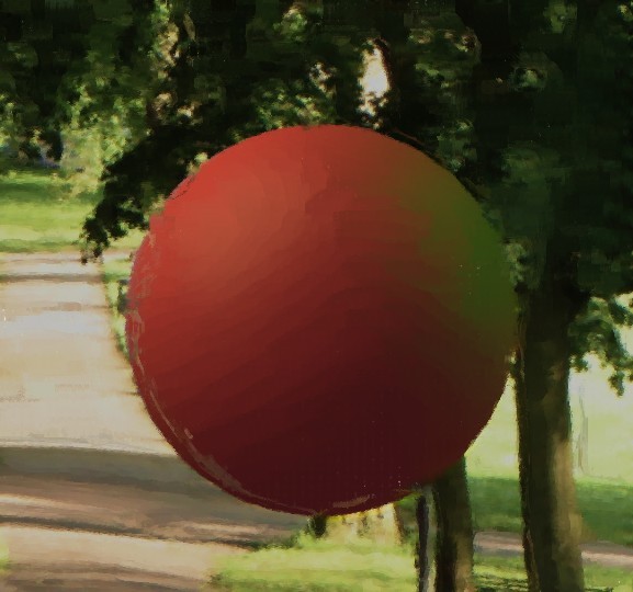
2) Using a large brush, with colour cloning on, smooth out the background.
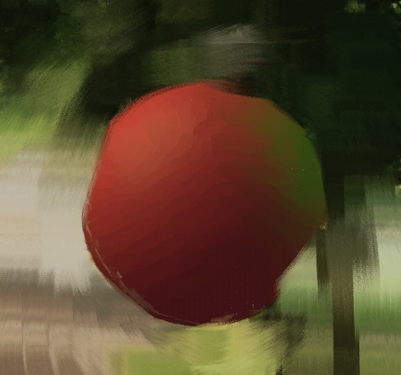
3) Turn off colour cloning, and using the eyedropper tool to match the background, apply soft edged blocks of colour where you think it will look good: soften any distracting details, and add shadows and highlights where they look nice and help make the important foreground details pop. The coarse oily blender can help soften details.
I made the background darker near the green part of the ball, so it didn't vanish into the green background.
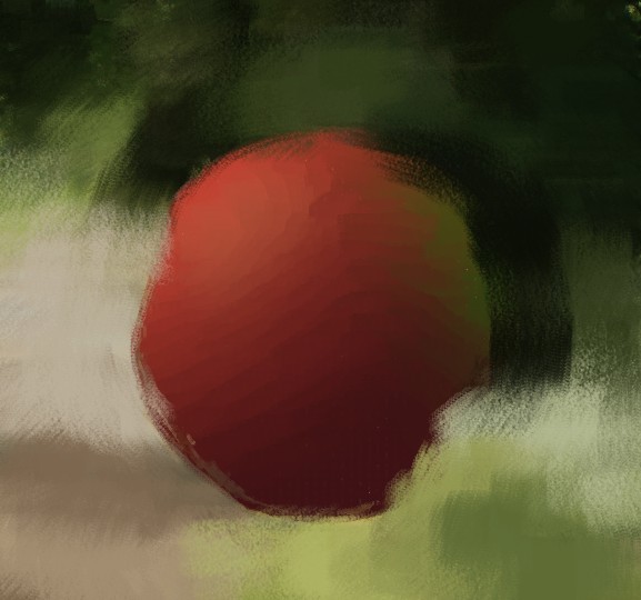
4) Turn on the tracing paper. Use a medium-small brush with colour cloning on to neaten up the foreground and define the edges of all the important shapes, especially the boundary between the foreground and background.
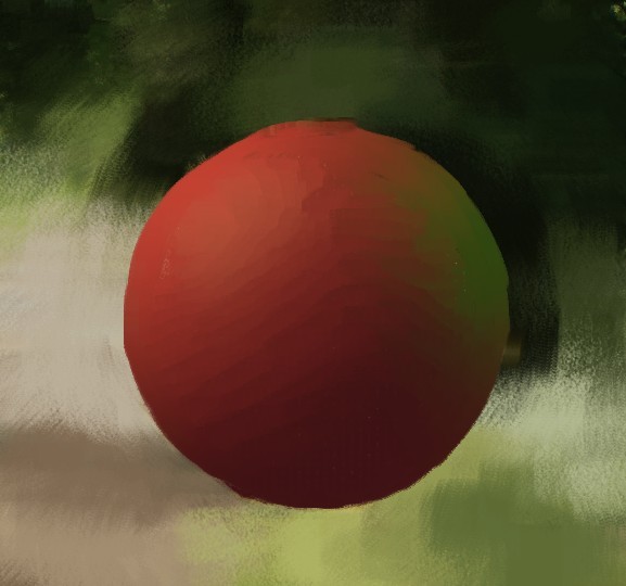
5) Go through from back to front and paint over any parts that don't look good:
i) With colour cloning off, use the eyedropper tool to sketch out midtones, shadows and highlights for the foreground. Important details are saturated, high contrast, and detailed with small strokes. Unimportant details, including the background, are desaturated, soft, and flattened by large strokes. If a part looks a bit flat, use colour cloning to add back some detail and intermediate colours. Use the tracing paper to keep the shapes right.
In this case I used about 6 different colours: two red midtones, a dark purple shadow, an orangey highlight, and a greenish highlight. I used colour cloning to smooth anything that looked wrong. I didn't tweak any of the colours to be more intense, just to show how meh it looks.
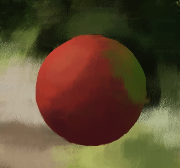
ii)Add extra shadows, highlights, and outlines to any parts you think need the extra definition, like facial features and the boundaries between characters. Tweak anything too bland to be more intense, eg if the highlights are primarily orange-yellow, make them brighter and yellower, and make the shadows darker and bluer.
In this case I made the shadows darker, the green highlight brighter and greener, and added two levels of brighter and yellower yellow highlight. I used these colours to create outlines, and then softened them with red midtones.

6) Look at the painting as a whole and tweak anything that looks off, including adding rough sketchy softening colour with a large-ish brush or Coarse Oily Blender to any parts that stand out when they shouldn't.
I used a coarse oily blender on the background, which I probably should have done in step 3 but never mind.
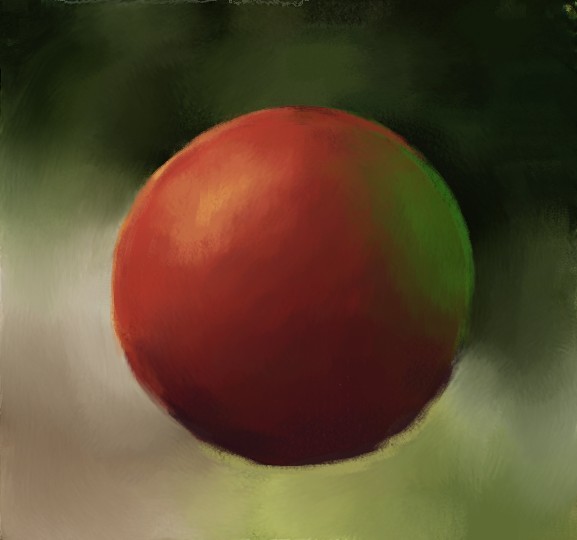
7) Create a new layer. Sketch over soft blobs of colour where they'll balance things out. Set the blending type to whatever looks nice, probably "overlay", "soft light", "multiply, or "screen".
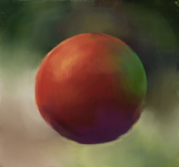
I used screen for this colour layer, at about 20% opacity. If I actually cared about this picture I'd tweak the colours more, and maybe add a second colour layer to darken the outer edges, but this gives a rough idea of the effect. The black parts were originally transparent.

8) Stop painting! Be proud of what you have created!
Some useful things to understand.
I should...probably watch some oil painting/pastels tutorials, huh >.>
With examples where it might not be clear what I mean:
I learned a lot by looking carefully at any painting I thought was pretty and trying to figure out WHY I thought it was pretty, and how I might most easily replicate the effect.
Art doing the sort of thing I'm aiming for:
More varied artists I find inspiring:
My basic philosophy is: realism is boring, and mistakes add texture.
 |  |
This painting technique works just as well for photos as for the sort of 3D renders I usually do, you can skip the 3D model section if that's not relevant to you.
Sections:
Introduction
The main reason I do paintovers is that I'm never satisfied by the results when I try to softly shade three dimensional shapes by eye, especially faces or anything with dramatic lighting.
What I can draw to my own satisfaction is anime style flat shading. So my approach to paintovers is to think of them as flat shaded images with simple highlights and shadows, and even lines. I use the original image to get the colours and gradients right, which combined with rough grainy strokes creates an illusion of the sort of soft, three dimensional shapes I have trouble with. I use rough brushstrokes and a limited palette since (a) it's less work and (b) it creates ambiguity, and the viewer's imagination fills in the details better than I can paint them.
If your artistic instincts are different to mine, this approach may not be very helpful.
To give an example, here is my drawn version of Useful and Pretty, and here's my (not entirely successful) attempt to create the equivalent scene as a paintover of a 3D render.

Here's a prettier paintover I've done:

Creating the model
I use Blender, which is difficult but free. I'm no good at making people but I can create simple 3D objects like glasses/candles etc.
This is a screenshot of the Blender scene used to create Nothing's Wrong. There's models of Isabela and Hawke as well as fabric, a candle, a table, a map, beer glasses, beer foam, and eight light sources of different colours and shapes. I also used two large planes to block the light from parts of the scene but if I'd included those you wouldn't be able to see anything else. The aqua background is a large plane with an edited screenshot of the Hanged Man on it.

For fanart of video games, I download models of the characters as extracted by other people. There's a program called XPS/XNALara specifically designed for posing and rendering such models, and most models I've found have been in XPS format. I've never tried XNALara, since I don't want to learn a new program, and XPS models can be imported to Blender using these Blender to XPS tools. You can find a lot of XPS models on deviantArt, and Padme4000 has a lot for Bioware games in particular.
Posing the models is fiddly and takes practice. There's tutorials on it around the place. Looking at images of of real people (including myself in the mirror) can help make the body language more believable.
The way I compose these scenes is generally one or two figures and key objects in the foreground, and then a blurry quasi-abstract background which varies in brightness and colour to help highlight whatever I want to emphasise in the foreground.
This background is created via a single flat image, an Emission (glowing) material on a plane angled to face the camera and sized to fill the view.
I create the background image in a separate art program, starting with a canon screenshot and adding a few extra shadows or colour blobs, tweaking it once I've seen how it looks inside the full render.
Sometimes I just use a flat wall instead, as in A Chance to Rest, but this doesn't look as nice.
I start the lighting with a glowing torus with a rainbow of light inside, to create some subtle variation in the light. I then add spot lighting, usually bright orangey colours on the faces and understated blue-ish colours in the shadows. Dark skinned people tend to look best lit by more saturated colours, and pale skinned people by more unsaturated ones. I use opaque or semi-translucent planes to block light from anything I want to keep in shadow, though this can look weird if I'm not careful.
Creating the Paintover
I currently use the program Corel Painter Essentials, since it has some useful features, but any art program can be used in theory.
The basic method for making a paintover, as illustrated in this post:
- Colour Correction: It's much easier to do this in advance than try to edit things on the fly while painting, though I always end up doing that too. I'm going to call this edited version "the original image" from now on.
- Base texture: Create a textured version of the original image using some sort of paint-like digital filter.
- Painting: Flatten the colours into midtone/shadow/highlight, smooth out unnecessary detail with large flat brush strokes, highlight important detail with small strokes, outlines, and intense colour.
Painter Essentials makes creating the base texture easier with the "photo painting" tool, which autogenerates brush strokes using the same brushes I then use to paint by hand. I like using pastels. There are also free programs with brush filters, like Fotosketcher and GIMP, and even a simple blur is better than nothing.
Painter Essentials makes painting easier with the "clone colour from source image" and "show tracing paper" options in the "Photo Painting" tab. When colour cloning is on, all brush strokes match the colour of the original image. When the tracing paper is visible, a translucent image of the original image shows up. I use the tracing paper to see anywhere I've gone off track, and then I can use colour cloning to fix it. Artrage has similar features, but you can also just have an extra layer with the original image and check it/colour-pick from it manually.
Unless stated otherwise all painting is done using a pastel square brush. I generally increase the opacity when the brush is small and decrease it when big, eg small = 4 pixel brush 70% opacity, large= 40 pixel brush 30% opacity. A higher grain means denser, smoother colour, I tend to leave it at around 20 but tweak occasionally.
I use as few colours as I can get away with in each section, generally 1-2 each of shadow, midtone, and highlight. Midtones stay the same, but everything else gets more intense. If it doesn't look good I add more intermediate colours.
Important details tend to be saturated, high contrast, and detailed with small strokes. Unimportant details, including the background, tend to be desaturated, soft, and made of large smooth strokes. I use thin outlines of darker/brighter saturated colour on the edges of parts I want to stand out.
Ok! Now the specifics! As an example, I will paint over this render of a ball:
 |  |
1) Open Painter Essentials and generate a textured version from the original image using the pastel setting in the Photo painting tab. If it doesn't look nice, tweak the model, or do colour correction on the render.

2) Using a large brush, with colour cloning on, smooth out the background.

3) Turn off colour cloning, and using the eyedropper tool to match the background, apply soft edged blocks of colour where you think it will look good: soften any distracting details, and add shadows and highlights where they look nice and help make the important foreground details pop. The coarse oily blender can help soften details.
I made the background darker near the green part of the ball, so it didn't vanish into the green background.

4) Turn on the tracing paper. Use a medium-small brush with colour cloning on to neaten up the foreground and define the edges of all the important shapes, especially the boundary between the foreground and background.

5) Go through from back to front and paint over any parts that don't look good:
i) With colour cloning off, use the eyedropper tool to sketch out midtones, shadows and highlights for the foreground. Important details are saturated, high contrast, and detailed with small strokes. Unimportant details, including the background, are desaturated, soft, and flattened by large strokes. If a part looks a bit flat, use colour cloning to add back some detail and intermediate colours. Use the tracing paper to keep the shapes right.
In this case I used about 6 different colours: two red midtones, a dark purple shadow, an orangey highlight, and a greenish highlight. I used colour cloning to smooth anything that looked wrong. I didn't tweak any of the colours to be more intense, just to show how meh it looks.

ii)Add extra shadows, highlights, and outlines to any parts you think need the extra definition, like facial features and the boundaries between characters. Tweak anything too bland to be more intense, eg if the highlights are primarily orange-yellow, make them brighter and yellower, and make the shadows darker and bluer.
In this case I made the shadows darker, the green highlight brighter and greener, and added two levels of brighter and yellower yellow highlight. I used these colours to create outlines, and then softened them with red midtones.

6) Look at the painting as a whole and tweak anything that looks off, including adding rough sketchy softening colour with a large-ish brush or Coarse Oily Blender to any parts that stand out when they shouldn't.
I used a coarse oily blender on the background, which I probably should have done in step 3 but never mind.

7) Create a new layer. Sketch over soft blobs of colour where they'll balance things out. Set the blending type to whatever looks nice, probably "overlay", "soft light", "multiply, or "screen".
I used screen for this colour layer, at about 20% opacity. If I actually cared about this picture I'd tweak the colours more, and maybe add a second colour layer to darken the outer edges, but this gives a rough idea of the effect. The black parts were originally transparent.

8) Stop painting! Be proud of what you have created!

Tutorials
Some useful things to understand.
- Photo Studies
- Shading
- PurpleKecleon's Brief Explanation of Colour Theory
- How to do half assed digital colouring without learning colour theory
I should...probably watch some oil painting/pastels tutorials, huh >.>
Art practice which helped me learn relevant skills
With examples where it might not be clear what I mean:
- using a limited colour palette
- sketching without too much detail
- traditional media eg paints, coloured pencils, graphite pencil, pastels
- sketching a photo by eye, in colour or greyscale
- Bob Ross tutorials, in whatever art program you use for paintovers.
- flat shading with midtones, shadows, and highlights, coloured lines, and then a texture overlay
- Lineless flat colouring
- Painting and paintovers!
Art inspirations
I learned a lot by looking carefully at any painting I thought was pretty and trying to figure out WHY I thought it was pretty, and how I might most easily replicate the effect.
Art doing the sort of thing I'm aiming for:
- Oil pastels portrait of a Peruvian Girl
- She Knows in oil pastels
- Woman with Orange Hair
- Another one for the wall
- Concept art of Zora
- Portrait of Young Woman in Armor #2
More varied artists I find inspiring: